You know something's wrong right away on the first page. Why does this button say "NO" instead of "YES"? And one thing you can't tell here: hovering on the thing you actually have to click ("here") doesn't change the cursor as expected.
Things get really nasty on the next page. Lots of people at Ars just gave up here. Things to note: the password is not hidden, you have to manually delete text to enter it, ".jpg" is one of the domains in the drop-down, the password rules are ridiculous and hard to read, you have to check "I do not accept" instead of "I accept," and it just keeps going...
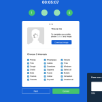
Next, you're asked to upload an image and select your interests. The image shows a loading graphic even when it's not loading, the button says download instead of upload (and really does download the image), and the checkboxes default to checked, but sometimes unchecking one checks another seemingly random box.
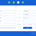
You'll then be asked to fill in your personal info. But the fields are ordered strangly, the age slider is very unhelpful, selection colors for male/female are reversed and there's no non-binary option, and some fields are uninteractable—to name just a few issues.
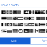
Choosing your country brings up this view, where you have to choose by flag. But the the flags are in black and white, which makes selecting one surprisingly difficult.
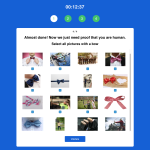
Finally, there's the CAPTCHA. This monster always gives you wording that could apply to any picture in the set, the checkboxes are in the wrong place in relation to the images, and it requires numerous repetitions with no feedback. (So, not that different from a normal CAPTCHA, we guess.)
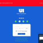
Sometimes we take Web and user interface design for granted—that's the point of User Inyerface, a hilariously and deliberately difficult-to-use website created to show just how much we rely on past habits and design conventions to interact with the Web and our digital devices.
Over the past decennium, users have grown accustomed to certain design patterns: positions, colors, icons... Rather than looking at a UI, users tend to act instinctively and take 90% of an interface for granted.
... But what happens if we poke all good practice with a stick and stir it up? What if we don't respect our self-created rules and expectations and do everything the other way around?
The resulting website is a gauntlet of nearly impossible-to-parse interactions that are as funny as they are infuriating. In one case, the colors for the male and female selection options in a personal info form are reversed compared to expectations: the white-backgrounded one is the selection, while the blue-highlighted one is the one you're not picking—and there's no non-binary option, either, of course.
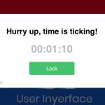
In another example, clicking to minimize a pop-up causes it to slowly—painfully—drop one pixel at a time out of view in a motion that Ars Technica's own Lee Hutchinson called "majestic... it's like a submarine slowly descending to the depths." (He's not making a compliment, really.) And as for the CAPTCHA, well, those are always a bit of a pain, but this one is a Dark Souls boss in UX form.
The page was shared on Twitter and Hacker News, among other places, by UX designers highlighting what a world without, well, UX designers would look like. And Inyerface thoroughly entertained Ars Technica writers who tried their hands at it today. It's not pretty, but in this limited context, it is funny. Most people don't survive the whole process the website is meant to carry them through, but if you like a challenge and more than a little pain, it is possible.
If you can't make it, though, just look at our images below for a summary of what's in store. And remember this next time you say a piece of software has "the worst interface I've ever seen"—we're pretty sure that's not going to be true anymore.


0 Commentaires